Web Component-ification: we've created Web Component variants for some of our commonly used CSS components: Switch, Radio Button, and Checkbox. These Web Components will help product teams with implementation, as there's less room for error with the markup than with the old CSS components — and they'll be way easier to update in the future! The original CSS components still work (in fact, that's what these new Web Components use as foundation), but we strongly recommend only using the Web Component variants from now on.
Popup Panel component: building on top of our recently released Popup Utility, the piping hot Popup Panel makes it fairly effortless to create your own custom popup panels — so you can insert your very own layouts for drop-down menus and such!
Enhancements
The option selected in our Select component can be cleared, returning it to an empty state — similarly to how it works in Multiselect. Use the "clear-visible" attribute to enable this feature.
The Multiselect filter in Datagrid now can be used on cells that contain arrays.
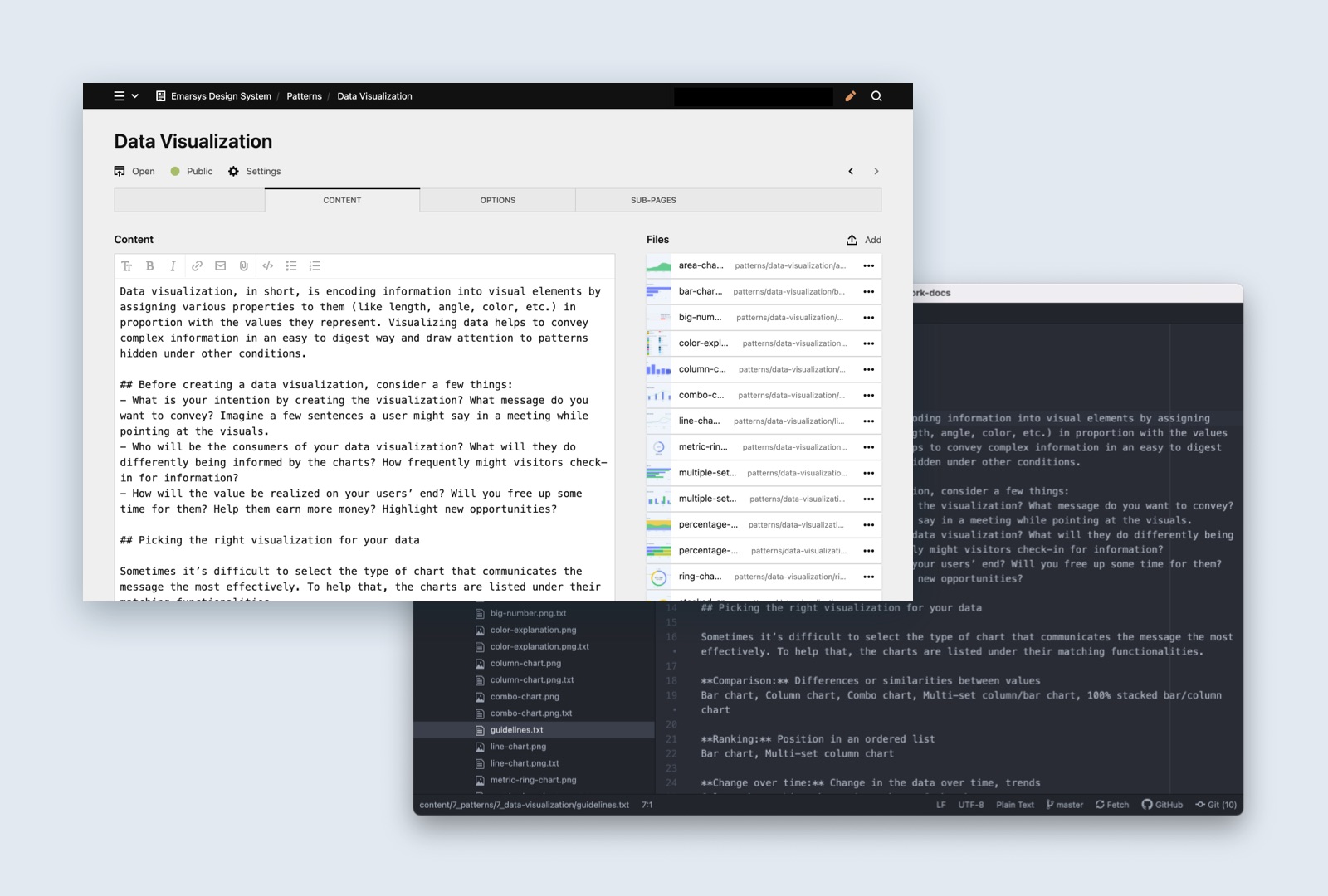
The Chart Columns can now use colors from our Color Library.
Changes
The Icon component got a new "default" value for its "size" attribute. Use this when you want to use the default size for the icon (typically 24x24 pixels), so parent elements cannot accidentally resize it.
Fixes
Date-Time Picker now uses the date format set by the user in My Profile.
The icon in the Notification component is now displayed in the correct size.
The Select component now can have a loading state even when the option list is empty.
Fixed Link Button style bug for its :active state.
Criteria component doesn’t break anymore when it receives an invalid JSON, instead it falls back to an empty object.
Icon Library Updates
Added new AC icons: ac-event-false, ac-event-true, ac-message-false, ac-message-true, ac-testing
Added new generic icons: e-tag, e-tag-remove, e-move-reorder
Excellent news, everyone! We're rolling out a brand new version of the Emarsys Design System website, which is the foundation for turning our Design System into something truly world-class.
In the past, updating the Design System website was somewhat cumbersome: creating, editing, and organizing content required the assistance of Design System developers, as the documentation lived inside the UI Framework's codebase. This made it difficult for other developers and designers to contribute to the Design System.
With the new Design System website, we've detached the documentation from the codebase, and put a lightweight and flexible CMS under it. This makes adding, editing, and organizing content a breeze for anyone who wants to contribute.
The CMS also comes with a lot of bells and whistles, which will help us implementing exciting new features in the future — and let me tell you, we are full of ideas!
With this initial release, we were aiming to cover all the existing functions and use cases of our old Design System website, and adding a few CMS-based features.
Here are some of the new features:
The admin panel makes adding, editing, and organizing content easier — but you can still edit the documentation on the code level, if you want to.
The search now has the ability to search for anything in the Design System — including guidelines, icons, and even release notes.
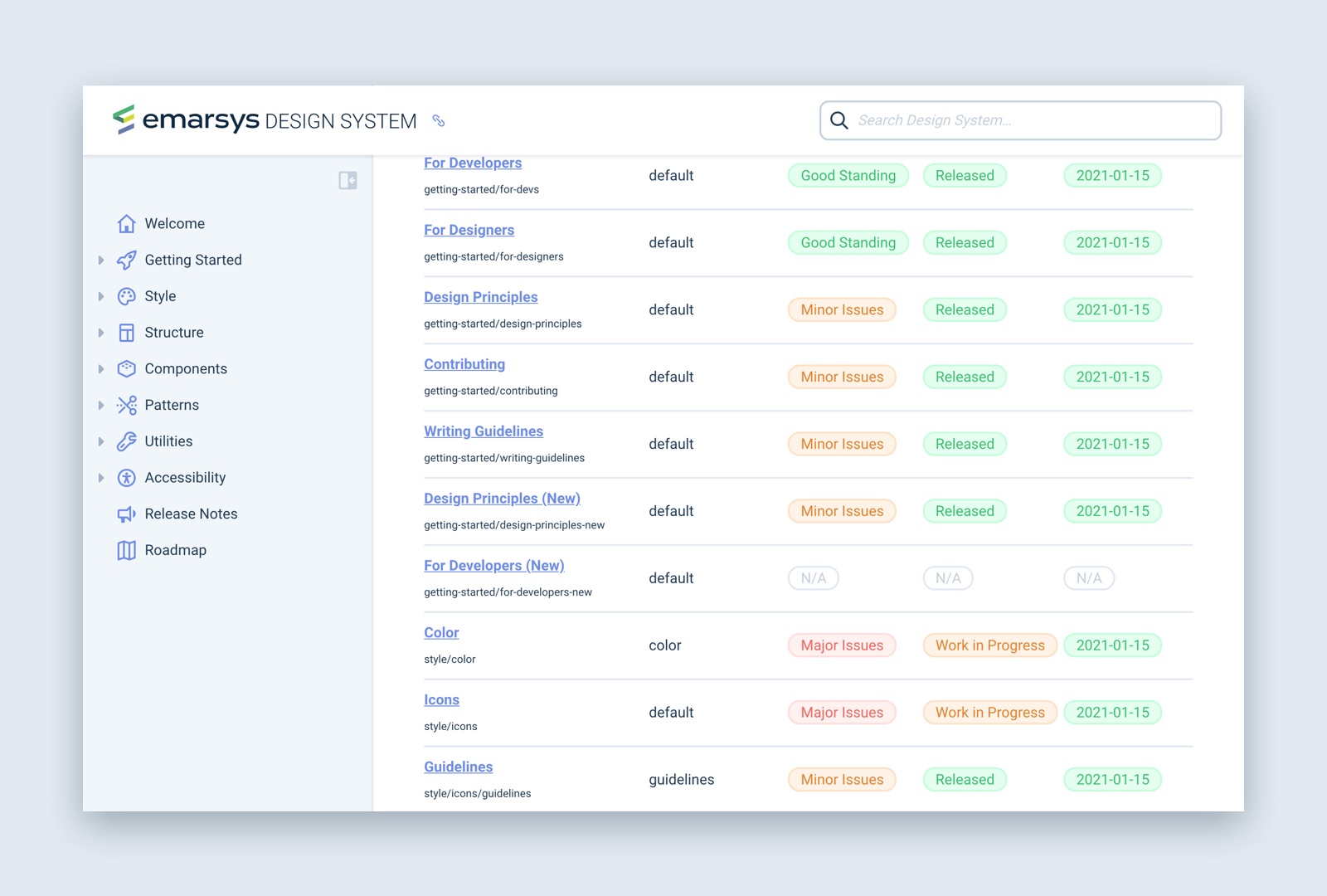
A new Health Check page shows the development status of all the components and guidelines.
The code examples are opened in the new and improved Design System Playground.
…and this is just the beginning, we're planning to enhance this new website with useful new features, such as the ability to cross-link documentation chunks, new content blocks in guidelines, and making content available only for authenticated Emarsys employees.
Outdated versions of the UI Framework documentation will remain available on their version-specific URLs. The last version to receive the old documentation was 14.880.0. Also, if you feel like taking a walk down memory lane, check out our Design System Museum for some nostalgia fuel.
If you have any feedback or questions, please get in touch with the Design System team via Slack!
Suggest Input component: our brand new Suggest Input component is an enhanced version of our text input. It displays suggestions from a list as the user types — similarly how search engines across the internet auto-complete your sentences. This component is really useful when we want to help the user enter a value that already exists in a list, but also want to give them the ability to use a new value that doesn't exist in that list.
Popup utility: the Popup utility helps in the creation of custom popover panels. Before this, only certain components had the ability to display popover panels, but now it's a lot easier to give this functionality to UI elements.
Enhancements
Notification components with the type attribute can be implemented in an alternative style, which looks better on light-gray backgrounds than the regular Notifications.
Notification components now can remember their closed state even if they were closed through methods other than the close button.
Using our brand new Truncate component, it's super easy to cut long words and sentences into a shorter form. Just set how many characters you want to display, and the Truncate component will do the dirty work. You can also set how many characters you want to preserve from the end of the long word, in case you want to cut out the middle.
This functionality is super helpful when you have to design with user generated content, where you cannot be exactly sure how long values will be.
We've expanded the search functionality in our Datagrid component. You can now search for multiple keywords, and also use quotation marks to search for exact matches. You can check it out in action on the documentation page
With the new Duration utility, there's now an easy way to format a duration in seconds in a human readable way. Previously this functionality was only available in the Datagrid component. Learn more about this utility on its documentation page
We've introduced a standalone Time Picker component! Up until now, this handy input was only available as part of the date-time picker - but now, it can be used on its own, giving our users the power to select hours and minutes easily. Learn more about this component on its documentation page
The new Notification component merges our old Notice and Alert components into one neat, flexible web component! This new component can be used in a myriad of different ways: for displaying useful heads-ups inside the page, or floating an error message over the whole layout. You can check out this new component at the design system website
Just a while ago, we've gone public with our Emarsys redesign. This was the first major design iteration on the Emarsys UI in more than 4 years, and so far we've received incredibly positive feedback from both our customers and our colleagues! There are so many things this redesign contains, including:
A new vertical navigation sidebar with overhauled information architecture.
An improved look and feel that brings the Emarsys UI closer to the Emarsys brand with fresh colours and typography.
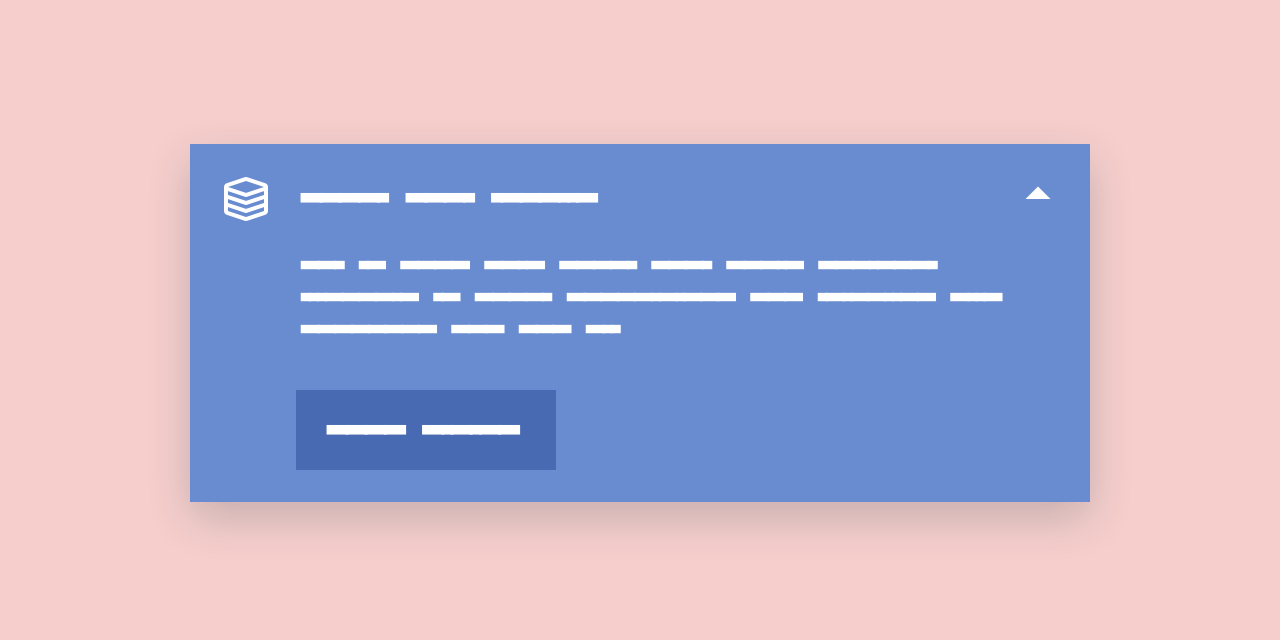
Please welcome our new family of components: e-upgrade. The various Upgrade components can help teams introduce upgrade opportunities for our beloved customers, to boost the capabilities of the Emarsys products they use.
You know how the saying goes: "pepper is small, but strong". This update is just like pepper.
e-actionlist: you can now hide the search field with the search-hidden attribute.
trackEvent(): implement analytics using our new trackEvent() JS utility. Read more about it in [Utility / Tracking](/utilities/functions/tracking.
CSS Border utility classes: add borders to your components with ease. Find out more in CSS Utility Classes.
Coming Soon: New Navigation
As you might already know, we're working hard on a brand new navigation bar — and since you've made it this far, let us reward you with a small sneak peek…
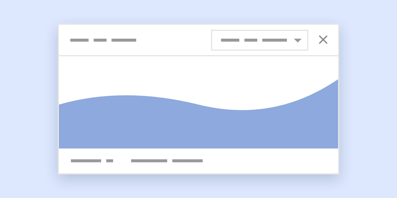
Introducing the e-widget. Widgets are ideal to display standalone data, like charts and tables — but they can also be used to include some controls that make sense on their own. Widgets feel right at home in dashboard-like pages. Head over to the guidelines page to see some pointers and examples.
Please welcome our new family of components: e-upgrade. The various Upgrade components can help teams introduce upgrade opportunities for our beloved customers, to boost the capabilities of the Emarsys products they use.
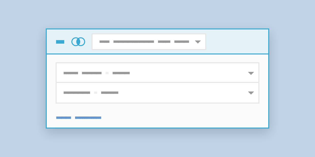
We're introducing a new component: e-criteria. This component provides an easy-to-use interface for users to set up complex queries to filter a dataset. It's ideal for finding resources based on multiple criteria – e.g. segmentation, filtering for users, filtering for products, etc.
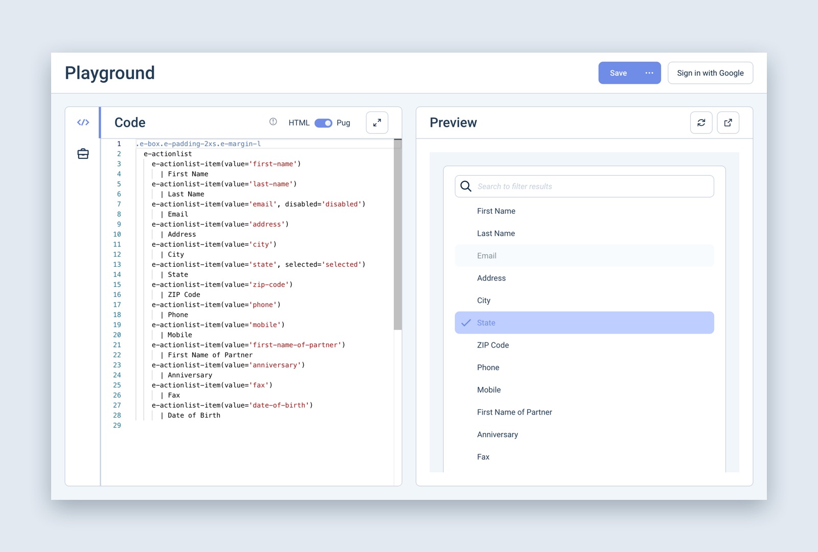
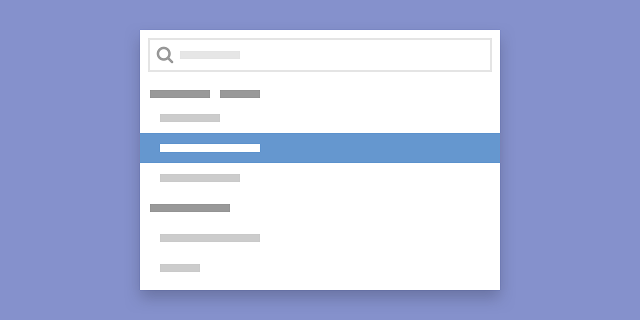
We're introducing e-actionlist, a brand new component which can display a list of actions — kind of like the list that's opened by our e-dropdown component. The items are searchable, group-able, and can have various different states.
This component will be used by Personalization, when users are inserting tokens: clicking on the "Insert Personalization" button brings up an Action List full of tokens, and the token is automatically inserted when the user picks it from the list.
As always, if you feel like you have something that could be replaced by this new component, go ahead and implement it — or if you'd like to have it expanded by new functionalities for your product, get in touch with us!